Plotting the results
In addition to the probability density distribution for the flux (see Results in real-time:), plots showing the computed electron density along each transmitter-receiver path are generated each time the vlf4ions.forecast_nowcast.nowcast.run() method is called.
The electron density at 70 km is computed on each path using results from the LMP model (see Estimating the electron density). The resulting plots are generated in pdf format, with the namelast_map.pdfat the specified path. An example is shown below:
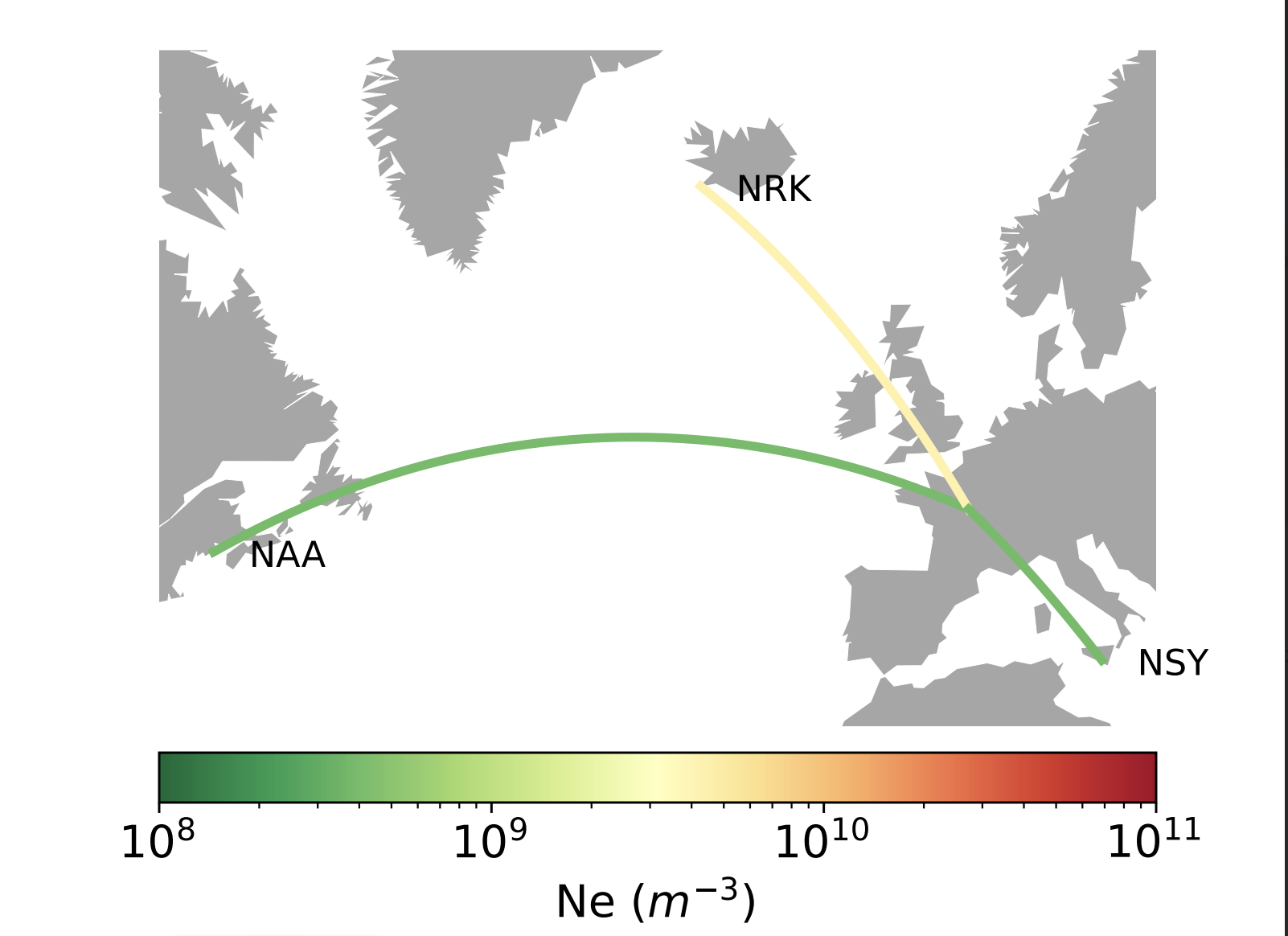
Example of output map obtained with the plot_map() function. The color of each path represents the electron density computed from the values of DA and DP for each station.
The plot_map() can also be used outside of the code, provided that each station is an instance of the station class and that DA and DP are defined as attributes of this class.
The upper bound for the colorbar of those map is automatically increased if needed to represent all computed densities (at 70 km).